511 Traffic Alert
Download App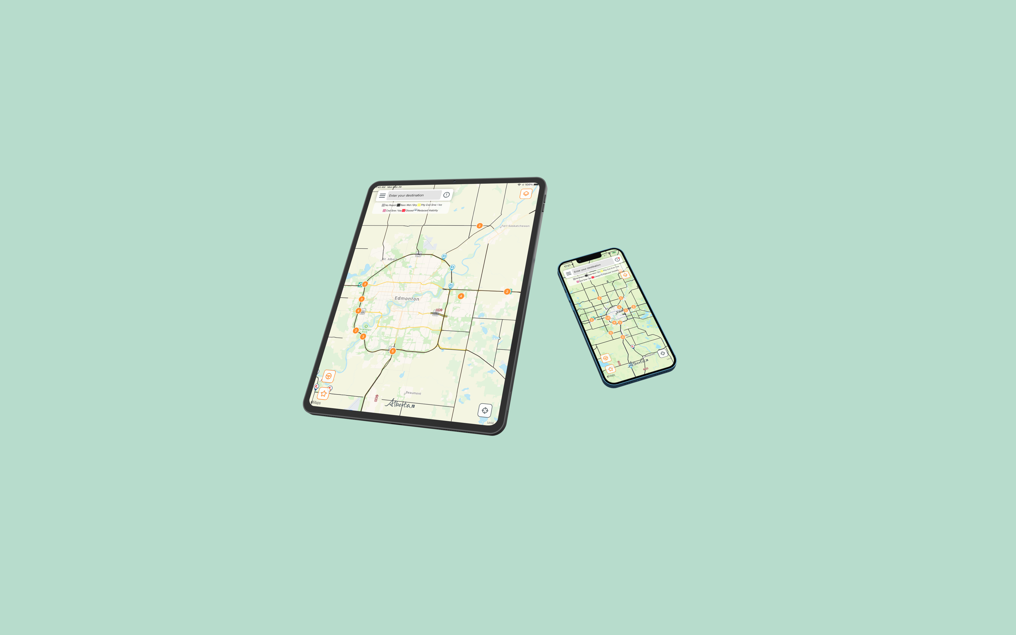
Project Vision
My Role
Timeline
My Contributions
I led a half-year-long design transition for the main product - 511 Transportation Application of the mobile team in IBI Group Inc. I took ownership of the entire App UI/UX design and implemented all UI views with SwiftUI & UIKit from scratch that achieving MAU + 450%.
Research Analysis
Kickoff Meeting
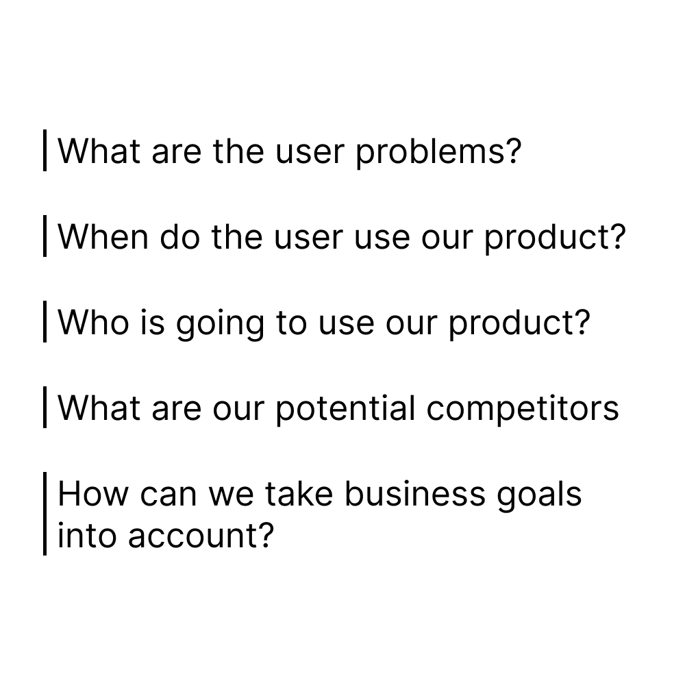
We started our kickoff meeting by asking ourselves some initial key questions. These questions help us reduce design biases from the beginning.
Affinity Diagram
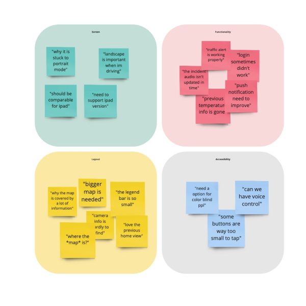
I synthesize reviews from Apple Store & Google Play Store for the current app version. They were categorized into 4 sections: Screen, Functionality, Layout, Accessibility.
Competitor Audit
511 Traffic Alert has the opportunity to provide customized product services that benefit users in different regions where they can get the most suitable traffic information.
Target User Group
I recapped the target user group that representing primary, secondary, supplementary user situations.And from these target groups, I visualized three common users.

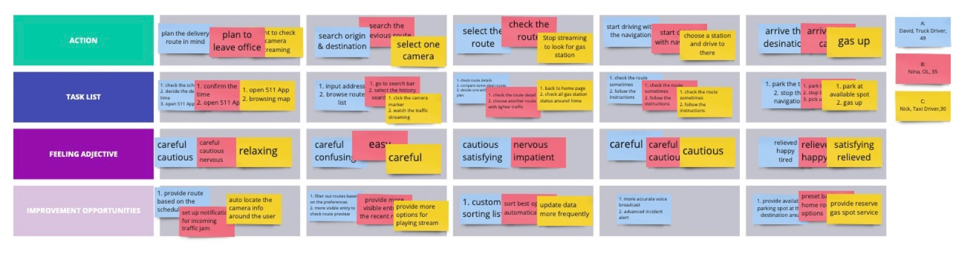
User Journey Map
I created a user journey map based on our target user groups (3 types), consisting of 4 sections: Action, Task List, Feeling Adjective, Improvement Opportunities. This helps us in understanding ways users can interact with the product, as well as allowing us to see navigation through user goals.
Research Insights & Design Challenges
1. Bigger Screen Support
Users want to use the app with tablets because they can have a large screen to view more traffic markers at once
2. Vision Accessibility
Users who have vision disabilities would like to have a higher contrast color theme and bigger font sizes.
3. Notification Customization
Users want to customize push notification selections and traffic alerts to filter out useful information.
4. Minimalistic UI
The map-dominate view is what users need. They can save tons of time scrolling & browsing views.
Prototype & Iteration
After completing the user journey map, I started working on a prototype implementation. I experienced 7 rounds of iterations to refine our design based on usability tests running internally & externally.

Bigger Screen Support
I designed a series of layout styles automatically supporting different screen sizes of various devices. The layout can adjust the rotation of devices in both portrait and landscape modes. Users can have a smooth and consistent experience when using tablets.
.png)
Vision Accessibility
I added WCAG check through the entire app and updated all the color themes. The new color system not only takes into account the customer branding color but also ensures a good user experience for visually impaired users


Notification Customization
Users can toggle push notifications based on regions and control the traffic alert types through onboarding flow.

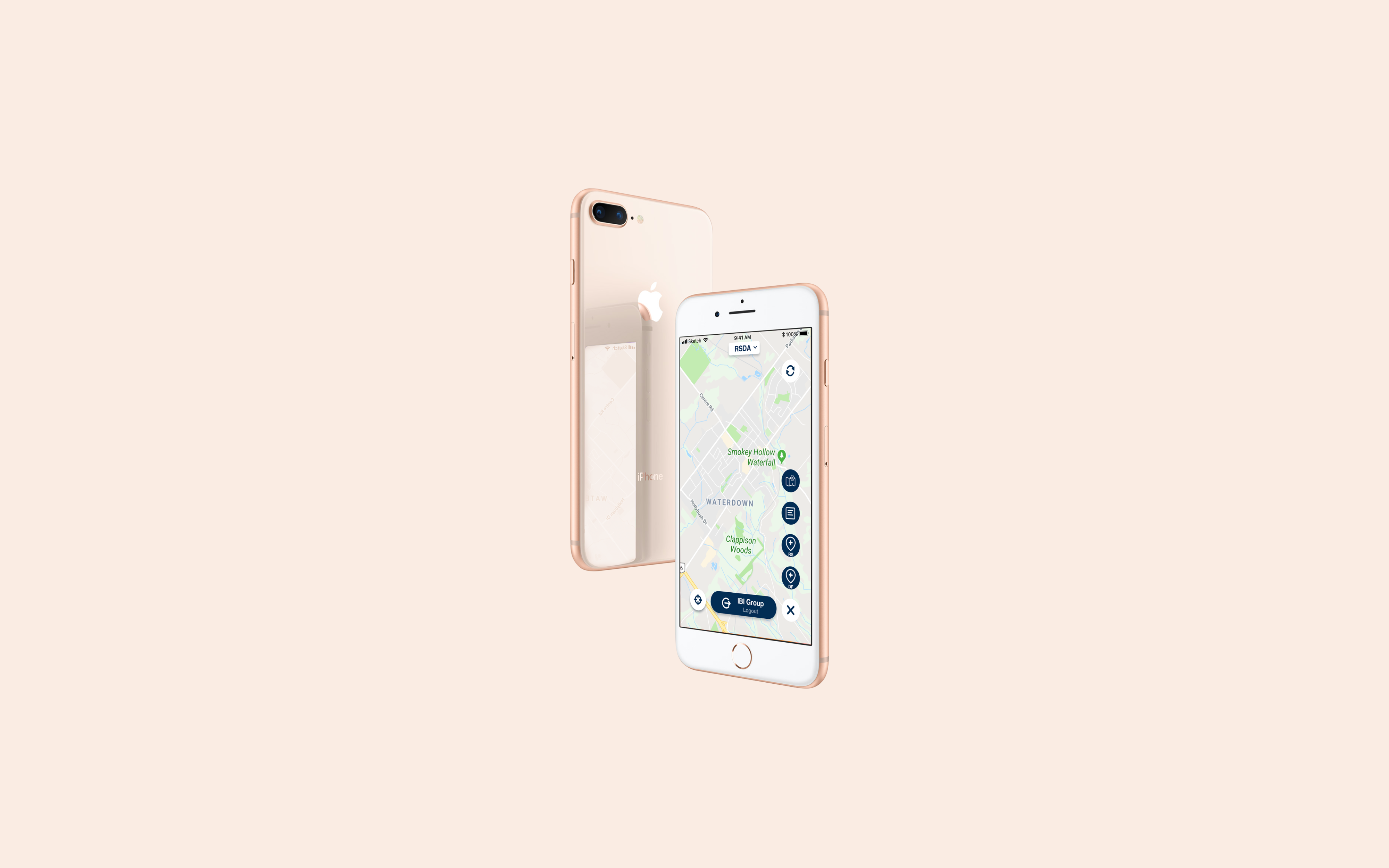
Minimalistic UI
I redesigned the entire UI style and brought a concise and mobile-friendly layout to users which shows the map-dominate view.
(Before & After Comparison)
%201.png)
Release & Achievements
Since the release of the first new version - 511 Alberta in May 2020, the 511 product line has ushered in a stage of rapid development. There are currently 10 apps in this product line across North America. Monthly active users (MAU) have also made a qualitative leap, with a year-over-year increase of over 450% at the peak.
.png)